Karolinska Institutet's logo
The Karolinska Institutet logo is the university’s signature and quality stamp and is to be used in all our communication. Learn more and find instructions on how to use the logo according to Karolinska Institutet's visual identity.
May we develop our own logo?
No, even when a department, division, unit or centre at KI is the sender of the information, Karolinska Institutet’s logo should be used. Karolinska Institutet's brand and logo represent the entire organisation.
How to use and position the logo
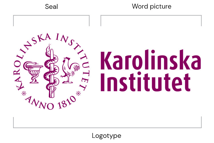
Karolinska Institutet's logo consists of the university seal and typographical name. The logo is to be seen and used as a composite and indivisible whole.
Horizontal version
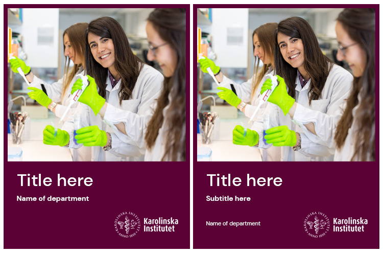
The logo is available in two versions, horizontal and vertical. The first choice should always be the horizontal logo.
If there is limited space in the layout or if the logo must be positioned centrally, the vertical version is more appropriate.
Digital logo
The digital version of the logo, with fewer details, is optimised for small sizes in digital channels. This version should only be used in digital contexts, for instance on websites, in social media, in films and PowerPoint presentations. For printed material, the original logo is still to be used.
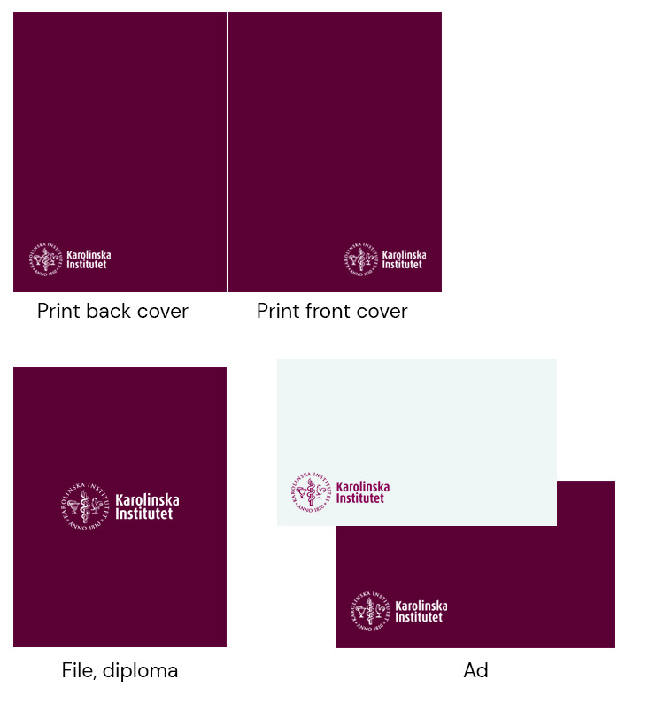
The logo and seal are available as positive (plum) as well as negative (white) versions.
Seal
The seal should always be used together with the typographical name. However, exceptions can be made when the format is too small and when it is perfectly clear that KI is the sender. One example would be in social media, where Karolinska Institutet is indicated in text right next to the logo. The seal can also be used on its own in solemn contexts.
Exceptions regarding the use of the seal without the typographical name must always be approved by the Communications and Public Relations Office.
Read more about
Logo position
The logo can be placed both on the right or the left-hand side, depending on the device being used. However, the placement of the logo should be consistent on similar devices.
Use KI's templates when producing a poster or a presentation, where the logo is already in the correct position and using the correct exclusion zone.
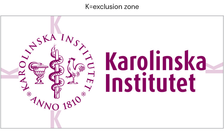
Exclusion zone
The height of the letter K illustrates the dimension of the exclusion zone. The exclusion zone is the empty space that must be left around the logo in relation to other graphics, text, or the edge of the surface.
Colours
The logo is available in both Plum and White and these are the versions to be used primarily.
As a rule, black can be used in printed material and printing when colour is not available. The logotype is sometimes used in silver and gold by the unit Akademiska ceremonier or for other special events. It can also be embossed on paper/cardboard or engraved in metal.
Profile your organisational unit with KI’s logo
Study programmes, projects, departments, research centres and other organisational units all help to augment the Karolinska Institutet brand by using the KI logo. No unit may develop its own logo, but can state its name in plain text alongside the KI logo. Enter the name of your organisational unit in the DM Sans font.
Profiling an external brand with the KI logo and brand name
Several things must be considered when using the KI brand in combination with external parties. It is important for the other brands to accord with KI’s activities. The way in which the KI brand may be used depends on the type of collaboration.
There are three different categories of collaboration:
- Karolinska Institutet as the main party
- Karolinska Institutet is part of a project run by one or more parties
- Karolinska Institutet runs a project with one or more equal partners
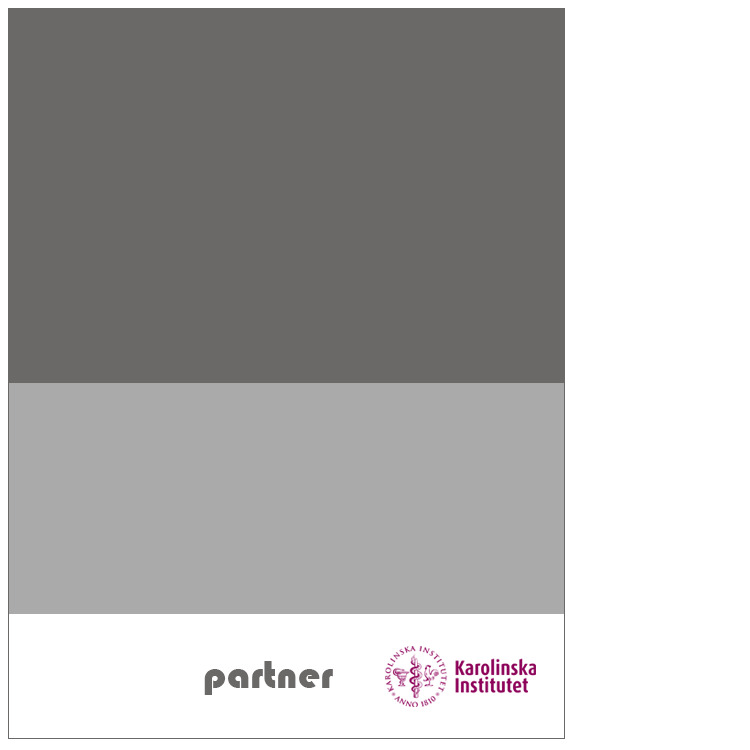
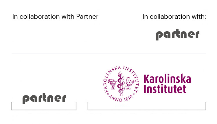
Karolinska Institutet as the main party
The design is to be based on the KI identity and graphic profile. The partner’s logo is to be rendered at about half the size of the KI logo and in most cases accompanied by an explanatory text (e.g. “In collaboration with”). The partner’s name can also be rendered in plain text without logo. If both are used, the logos are to be placed on opposite sides of the space allocated.
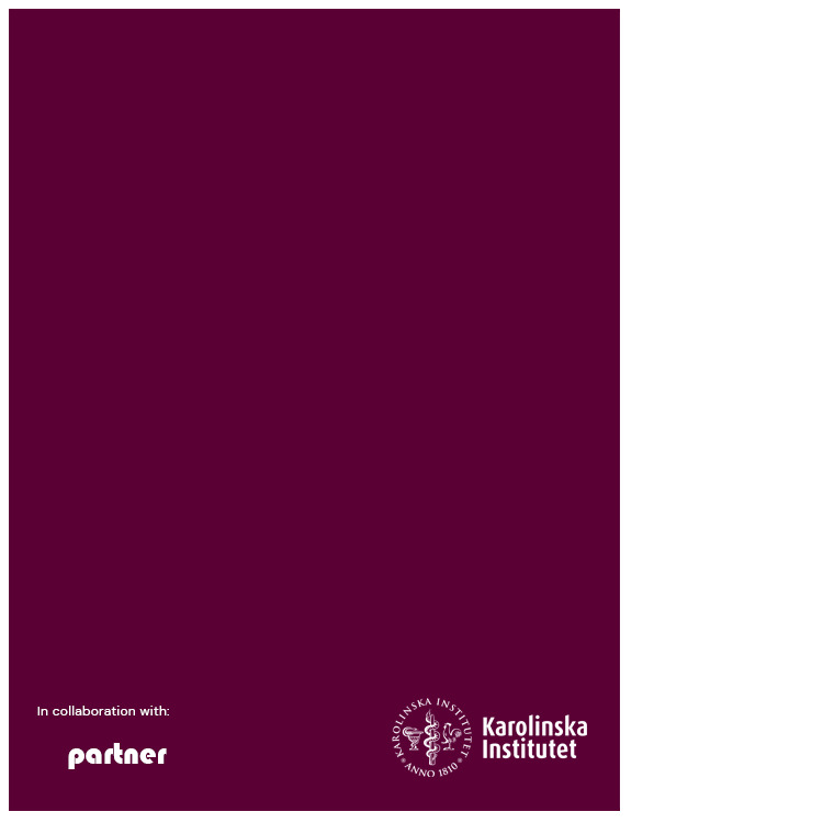
Karolinska Institutet is part of a project run by one or more parties
The design is not to be based on the KI identity and graphic profile. KI appears by name only, or by name and logo. If the KI logo is used, it is accompanied by an explanatory text (e.g. “In collaboration with”).
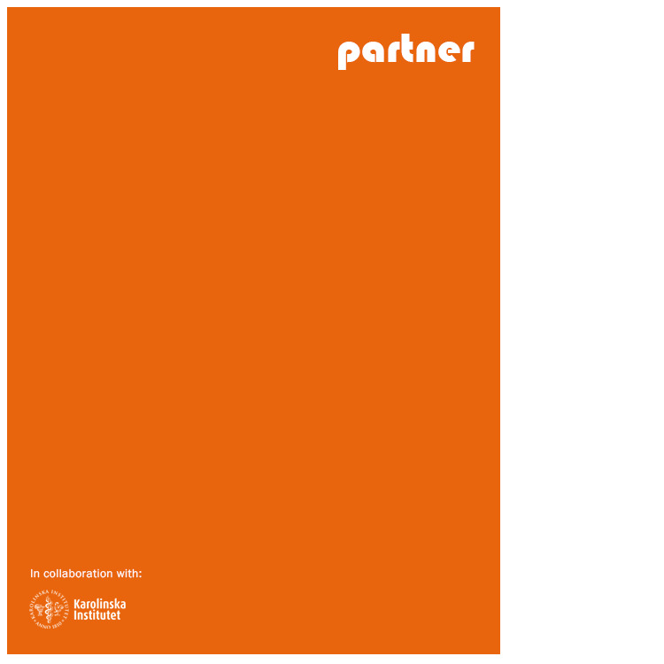
KI runs a project with one or more equal partners
The design is not to be based on the KI identity and graphic profile. Instead, a neutral design is to be used with the logos placed beside each other.