Testpage with all components
Here you can see a page with all blocks available in Drupal.

Image placements
In addition to a full size image across the page, you can also have left- or right-aligned images across half or a third of the page. The reason why you cannot choose the size of the images yourself is because they must work well in all resolutions of the page and in all variants of mobile platforms.

Text with half image on the left
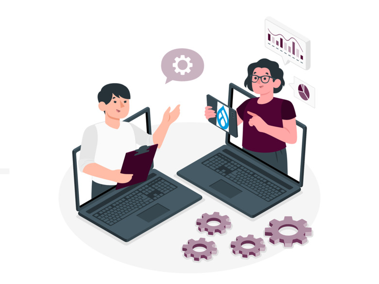
Editors or content curators at ki.se are welcome to the online Drupal workshop.
- Log in with us and work with ki.se.
- Bring questions about Drupal and web communication
- We at the web management are present to provide advice and support on simple and complex web issues.
Stay for a while or the whole session, you decide.

Text with half image on the right
Editors at ki.se are most welcome to web talk - a short lecture on a current topic in web publishing.
Facts about web talk
- Who can go? Editors in Drupal
- Where? Online
- How long is it? About 30 minutes of lecture and 15 minutes of questions
- Do you have to register? No. But feel free to save this event in your calendar, so you don't forget to check in.

Text with 1/3rd image right-aligned
Editors or content curators at ki.se are welcome to the online Drupal workshop.
- Log in with us and work with ki.se.
- Bring questions about Drupal and web communication
- We at the web management are present to provide advice and support on simple and complex web issues.
Stay for a while or the whole session, you decide.
Call to action
A call-to-action looks like a button. The function should be used when you want to invite something to do something, for example sign up for something. It should not be used to create menus.
Embedded Content
Embedded movies
Videos from YouTube and KI Play are embedded using different functions, but both work.
Embedded video from YouTube
Video embedded from KI Play
Documents

Headline levels
Text and image block headline level 2
Lorem ipsum dolor sit amet, consectetur adipiscing elit, sed do eiusmod tempor incididunt ut labore et dolore magna aliqua. Ut enim ad minim veniam, quis nostrud exercitation ullamco laboris nisi ut aliquip ex ea commodo consequat. Duis aute irure dolor in reprehenderit in voluptate velit esse cillum dolore eu fugiat nulla pariatur. Excepteur sint occaecat cupidatat non proident, sunt in culpa qui officia deserunt mollit anim id est laborum.
Headline level 3
Duis aute irure dolor in reprehenderit in voluptate velit esse cillum dolore eu fugiat nulla pariatur. Excepteur sint occaecat cupidatat non proident, sunt in culpa qui officia deserunt mollit anim id est laborum.
Headline level 4
Sed ut perspiciatis unde omnis iste natus error sit voluptatem accusantium doloremque laudantium, totam rem aperiam, eaque ipsa quae ab illo inventore veritatis et quasi architecto beatae vitae dicta sunt explicabo. Nemo enim ipsam voluptatem quia voluptas sit aspernatur aut odit aut fugit, sed quia consequuntur magni dolores eos qui ratione voluptatem sequi nesciunt.
Bullet and number lists
Neque porro quisquam est, qui dolorem ipsum quia dolor sit amet, consectetur, adipisci velit, sed quia non numquam eius modi tempora incidunt ut labore et dolore magnam aliquam quaerat voluptatem. Ut enim ad minima veniam, quis nostrum exercitationem ullam corporis suscipit laboriosam, nisi ut aliquid ex ea commodi consequatur?
Bullet list:
- vel illum qui dolorem
- eum fugiat quo
- voluptas nulla pariatur
Numbered list:
- Quis autem vel eum iure
- Reprehenderit qui in ea voluptate velit
- Esse quam nihil molestiae consequatur
Table
| Day | Opening hours |
|---|---|
| Monday | 8:00-16:00 |
| Tuesday | 8:00-16:30 |
| Wednesday | 14:00-15:30 |
| Thursday | 10:00-19:00 |
| Friday | 8:30-17:00 |
Contact card
Contact card generated via IDAC.
Jenny Hermansson
Communications OfficerContact card generated via IDAC also shows info from the profile page, if the person inserted any text there:
Jenny Hermansson
Team leaderFact box
The fact box has its own font, and can be framed in several different colors. The color is thin line around the fact box. If you have a heading in the fact box, it also gets the same color.
Nulla congue, tortor et congue feugiat, elit odio iaculis dolor, sit amet pharetra ante lorem vitae libero. Vestibulum vestibulum urna vel sem commodo, vel porta sapien pharetra. In porttitor ut dui ac sodales. Pellentesque suscipit vulputate sem vitae tempus. Praesent volutpat egestas nisi, nec pellentesque diam hendrerit nec. Etiam non fringilla magna. Pellentesque habitant morbi tristique senectus et netus et malesuada fames ac turpis egestas. Mauris mattis dignissim nunc vel tincidunt. Quisque et gravida risus, vel scelerisque est. Ut aliquet tellus a fermentum ultricies.
- Etiam non fringilla magna.
- Pellentesque habitant morbi tristique senectus et netus et malesuada fames ac turpis egestas.
- Mauris mattis dignissim nunc vel tincidunt. Quisque et gravida risus, vel scelerisque est. Ut aliquet tellus a fermentum ultricies.
Quote
If you do not ask, you will never find out.
Agenda
Introduction
The meeting begins by introducing the conferencier.
Coffee break
The coffee is served in the lobby
First track
The first track of the conference
Start of day 2
Accordion
An accordion can improve the user experience — if used for the right reason and the right content. Let’s look at some use cases in which you should use an accordion.
- When readers only need a few key pieces of information: If readers only need some information on a page, then an accordion can help them more easily and efficiently find the information they’re looking for. FAQ pages often use an accordion because many readers are coming to find an answer to one or two questions only.
- When readers will be viewing your site from smaller screens: If you’re challenged with fitting a lot of content on a small screen like a mobile device, then an accordion can help give readers an overview of what the page is about and reduce how much they need to scroll.
Despite its many benefits, an accordion is not always the best choice for your website design. Let’s look at some reasons why you wouldn’t want to use an accordion.
- When readers will need to click on the majority of accordion items: If users need to open the majority of accordion items, then it’s better to reveal all the content instead of hiding some. That way you won’t be forcing users to decide which headings to click on and to click on them one at a time, which can be cumbersome.
Promos, one to three in a row
 Photo: Sunny_mjx
Testpromo 3 Om Karolinska Institutet
Karolinska Institutet är ett av världens ledande medicinska universitet.


