KI's colour palette
Karolinska Institutet's colour palette is based on the plum colour which is one of KI's main identity bearers. The colour palette is designed to create dynamism and a modern expression and contributes to KI having a consistent visual expression. The colours meet the accessibility requirements in terms of contrast and readability.
Primary colours
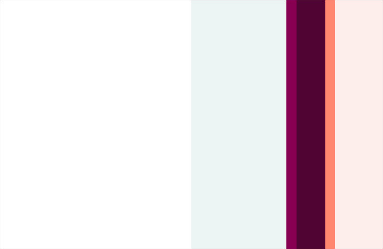
There are five primary colours in addition to black and white. The primary colours are dark plum, orange, light orange, light blue and plum.
Plum and dark plum, together with the logo, are the main elements in KI's brand and visual identity. Dark plum is used in text, as a background colour and in infographics. Plum is mainly used in the logo and in infographics/illustrations (not to be used a background colour in any upcoming produced material). Light orange and light blue are primarily used, along with white, as background colours. Orange is used as an accent colour, for instance to highlight specific content. Black is mainly used as text colour.

Primary colours codes
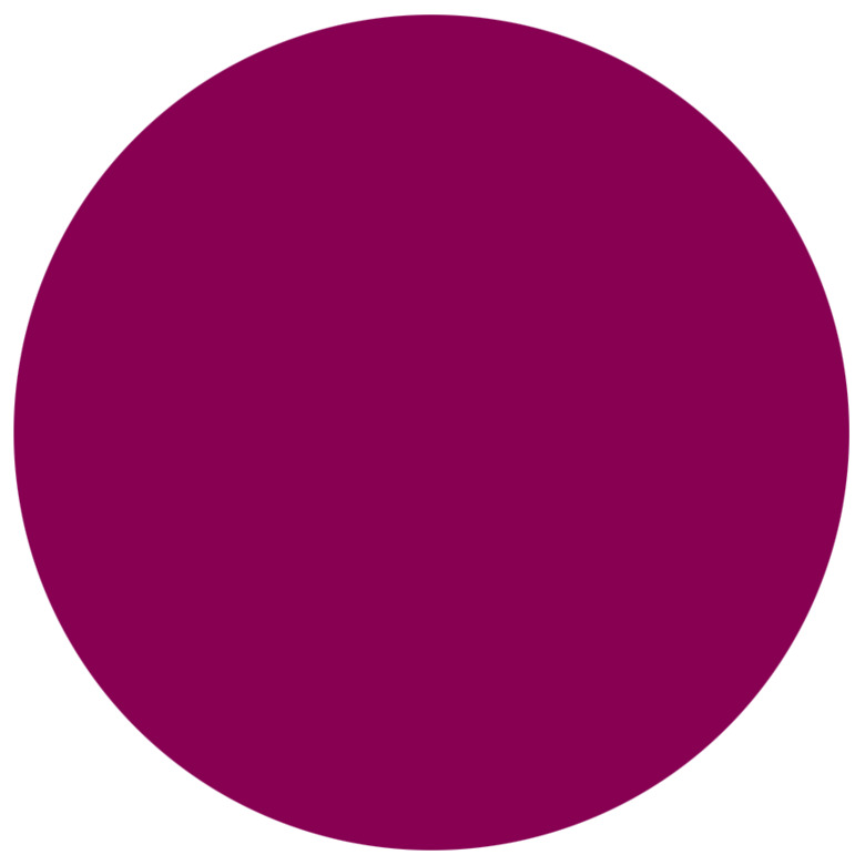
Dark plum
Print:
CMYK 20/100/0/70
PMS 229c / 2357u
Web:
RGB 79/4/51
HEX# 4F0433

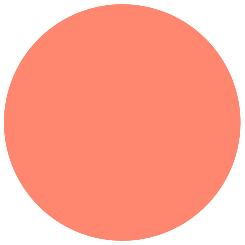
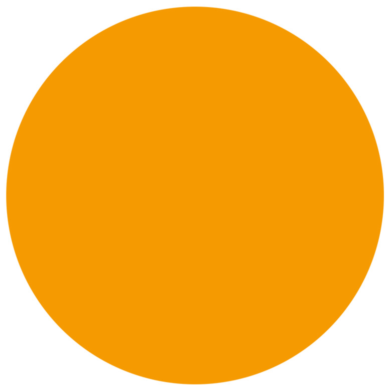
Orange
Print:
CMYK 0/60/50/0
PMS 170c / 2024u
Web:
RGB 255/135/111
HEX# FF876F

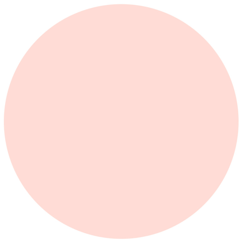
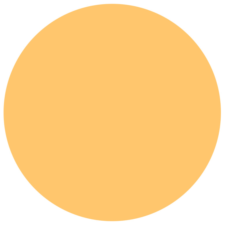
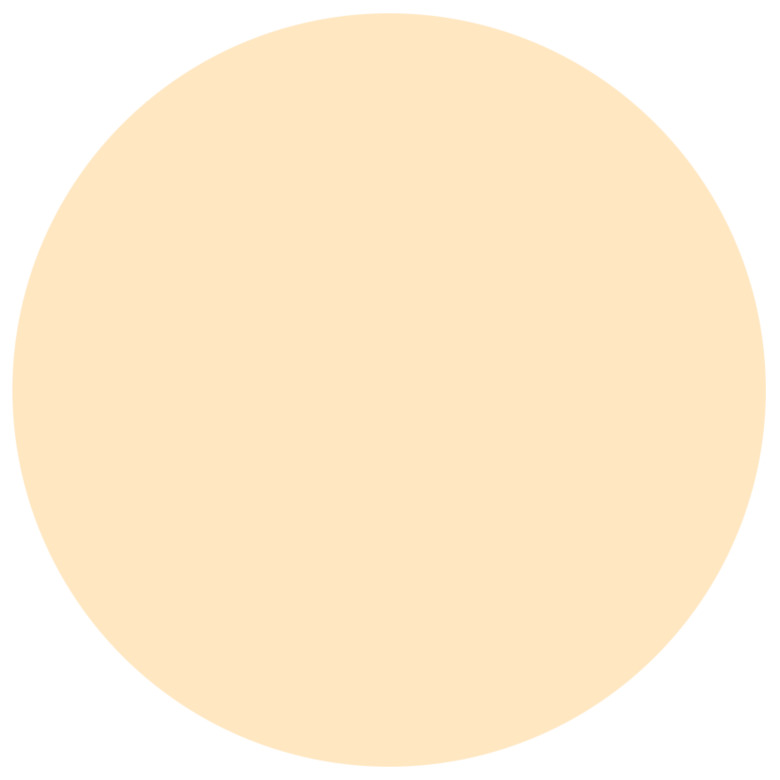
Light orange
Print:
CMYK 0/7/5/0
PMS 9280c / 9061u
Web:
RGB 254/238/235
HEX# FEEEEB

Light blue
Print:
CMYK 8/0/5/0
PMS 50% 9481c / 9424u
Web:
RGB 237/244/244
HEX# EDF4F4
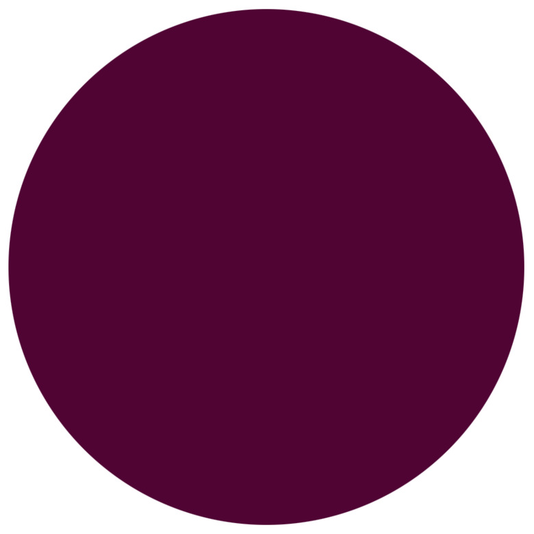
Plum (logotype)
Print:
PMS 228c/u
CMYK 20/100/0/40
Web:
RGB 135/0/82
HEX# 870052
NB!
KI’s graphic rules apply even if an organisational unit within KI is the main party, for example when creating a poster for a lecture you are organising or hosting.
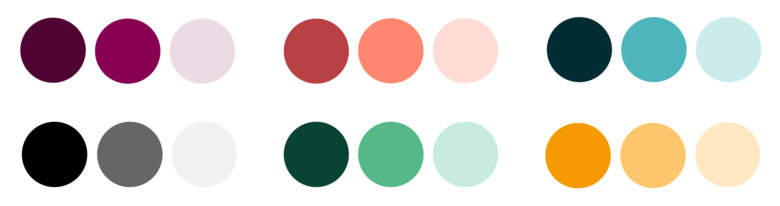
Functional colours
The functional colours can be used for charts, infographics or illustrations.
KI's functional colours consist of 6 colour clusters:
- plum
- orange
- blue
- grey
- green
- yellow
Each cluster in turn contains three shades of varying colour intensity. (The numbers indicate the order of priority).
Colour management – charts
To ensure a uniform expression, as well as good contrasts, we use a fixed colour order, where dark and light tones alternate:
- Dark plum
- Orange
- Plum
- Light orange (NB! Special code for infographics)
- Blue
- Light blue (NB! Special code for infographics)
- Grey
- Light grey (NB! Special code for infographics)
- Green
- Light green
- Yellow
- Light yellow
For accessibility, texts or numbers should be in black and placed next to the bar/chart section.
In graphs and charts, the brightest colours need to have outlines (0,5 pt thin black outline) to enhance contrast between colours.
Colour management – infographics
Infographics also build KI's identity. Therefore, the colour clusters of the primary colours plum (1.) and orange (2.) should primarily be used. Avoid a messy expression, no more than two colour clusters should be used.
Texts placed on coloured backgrounds can be either black or white. Choose the colour that creates the greatest contrast against the background colour.
Functional colour codes

Dark plum
Print:
CMYK 20/100/0/70
PMS 229c / 2357u
Web:
RGB 79/4/51
HEX# 4F0433

Plum (logotype)
Print:
CMYK 20/100/0/40
PMS 228c/u
Web:
RGB 135/0/82
HEX# 870052
Light plum
Print:
CMYK 8/15/5/0
PMS 9323c/u
Web:
RGB 237/219/228
Dark orange
Print:
CMYK 0/90/60/30
PMS 201c / 187u
Web:
RGB 184/65/69
HEX# B84145
Orange
Print:
CMYK 0/60/50/0
PMS 170c / 2024u
Web:
RGB 255/135/111
HEX# FF876F
Light orange (infographics)
Print:
CMYK 0/15/15/0
Web:
RGB 255/221/214
HEX# FFDDD6
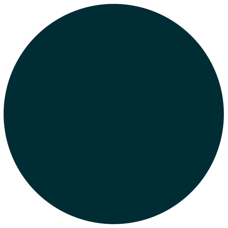
Dark blue
Print:
CMYK 100/70/60/40
PMS 2217c / 3165u
Web:
RGB 0/44/52
HEX# 002C34

Blue
Print:
CMYK 70/0/27/0
PMS 2397c/u
Web:
RGB 77/181/188
HEX# 4DB5BC

Light blue (infographics)
Print:
CMYK 18/0/10/0
Web:
RGB 204/235/237
HEX# CCEBED
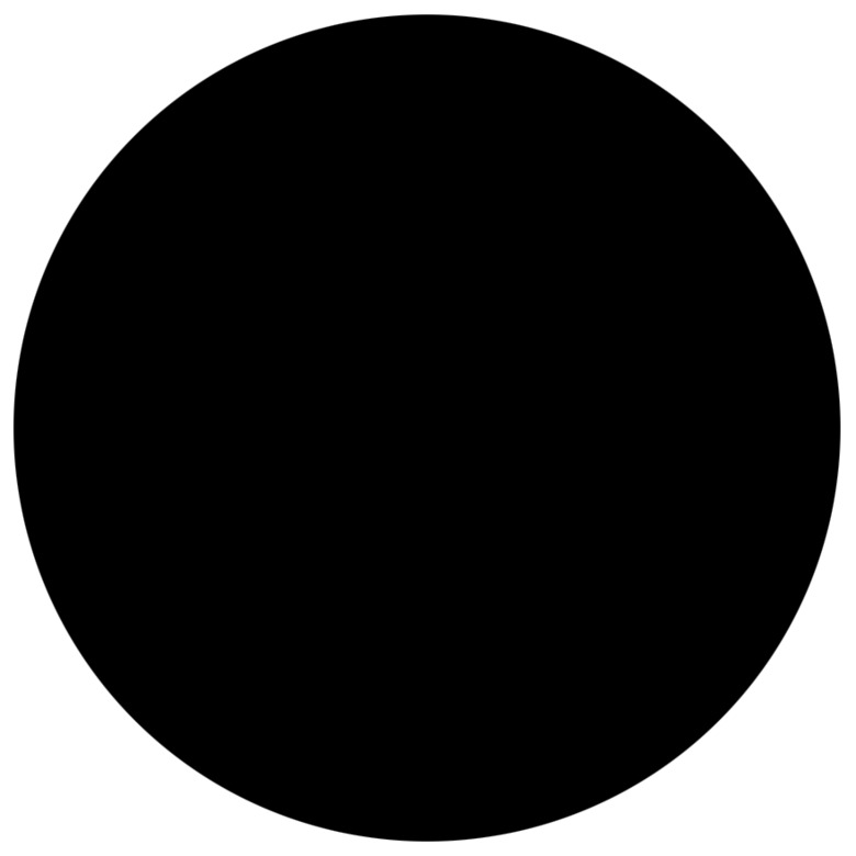
Black
Print:
CMYK 0/0/0/100
PMS Black
Web:
RGB 0/0/0
HEX# 000000
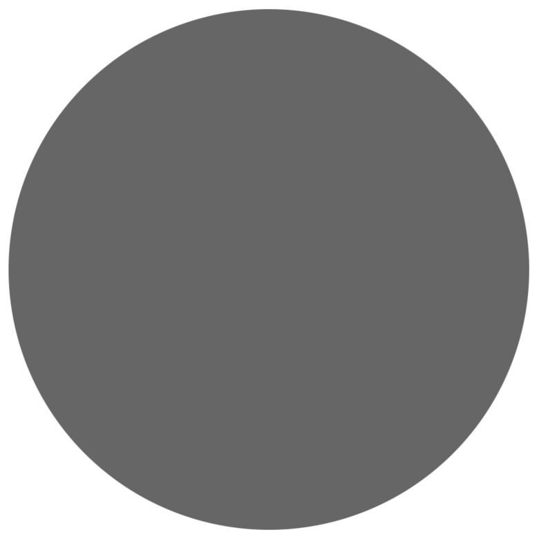
Grey
Print:
CMYK 0/0/0/70
PMS 70% Black c/u
Web:
RGB 102/102/102
HEX# 666666

Light grey
Print:
CMYK 0/0/0/10
PMS 10% Black c/u
Web:
RGB 241/241/241
HEX# F1F1F1
Infographics:
RGB 221/222/224
HEX# DDDEEO
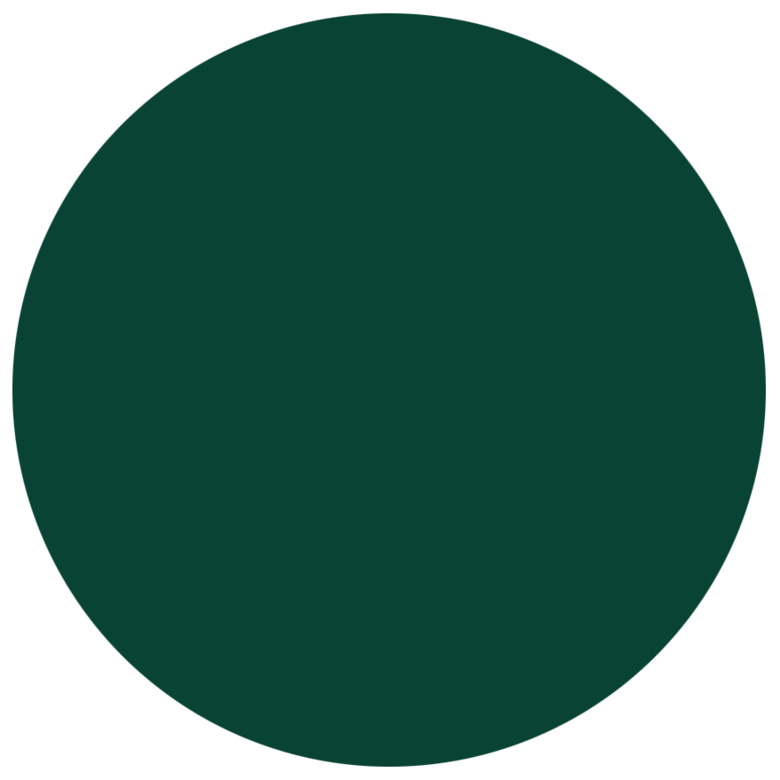
Dark green
Print:
CMYK 100/60/90/30
PMS 343c / 342u
Web:
RGB 9/67/52
HEX# 094334
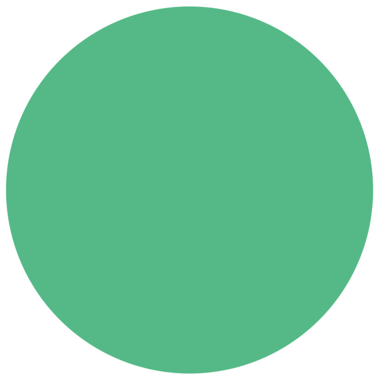
Green
Print:
CMYK 65/0/60/0
PMS 346c / 345u
Web:
RGB 84/185/134
HEX# 54B986
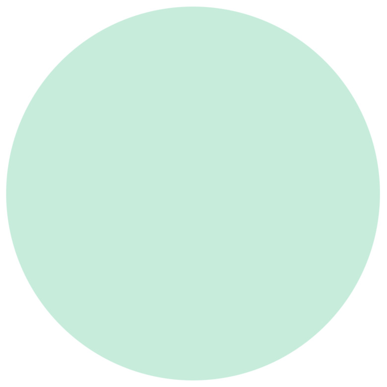
Light green
Print:
CMYK 25/0/23/0
PMS 566c/u
Web:
RGB 199/236/220
HEX# C7ECDC
Dark yellow
Print:
CMYK 0/50/100/0
PMS 2012c / 130u
Web:
RGB 245/154/0
HEX# F59A00
Yellow
Print:
CMYK 0/20/60/0
PMS 1345c / 2005u
Web:
RGB 255/198/109
HEX# FFC66D
Light yellow
Print:
CMYK 0/10/25/0
PMS 9160c / 9224u
Web:
RGB 255/231/194
HEX# FFE7C2
Colours and accessibility
Colour combinations
The letters within the circles show possible colour combinations that generally meet the accessibility requirements when it comes to readability and contrast.
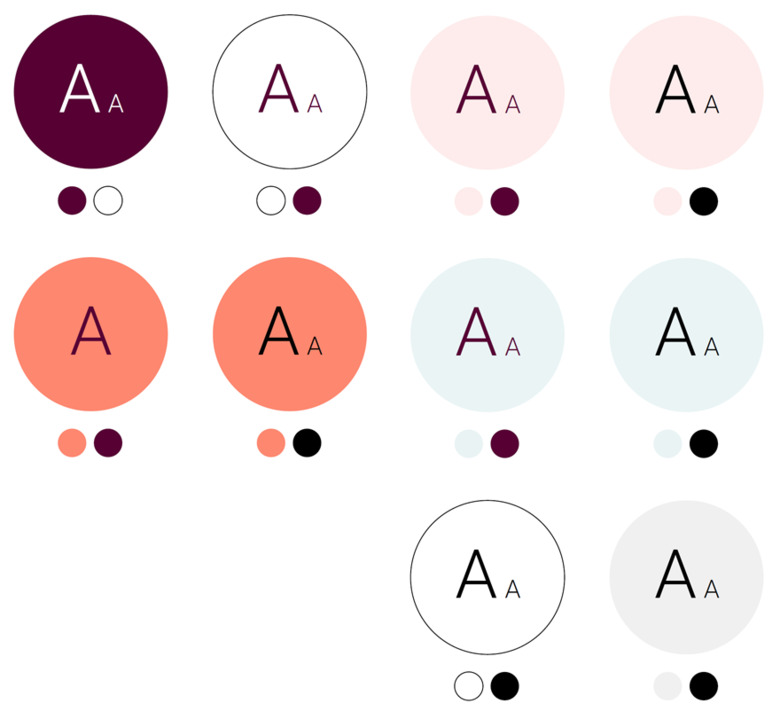
WCAG guidelines* 2.1.
The size of the text also affects the colour impression and thus the readability, especially in digital media. Therefore, specific recommendations regarding text sizes can be found in the WCAG guidelines*. The examples are based on plain text on a large scale of at least 18 pt/24 px and smaller text of at least 14 pt/18.5 px.
The letters in the circles above correspond to the mentioned dimensions, for larger and smaller text, and indicate which colour combinations are allowed. All colour combinations, except for plum on orange, work on a large as well as a small scale.
NB! Larger typography is generally used in digital channels than in printed matter (for example 16 pt body text on the web would correspond to approximately 9 pt body text in a printed matter).
*Web Content Accessibility Guidelines