Typefaces
In all our communication we use a single and modern typeface, DM Sans, in both digital and analogue channels. A cohesive channel-independent typographical expression creates a unified image of KI.
Typeface for branding
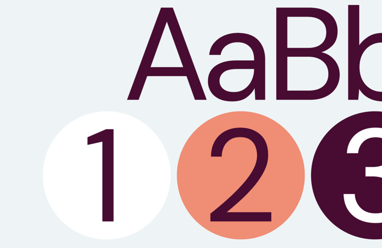
DM Sans Regular, Medium, Bold & Italic
DM Sans is used in both digital channels and in printed matters, for example in headings, body texts, captions, preambles, subheadings and buttons.
DM Sans is a Google font (i.e., license-free), thus easier to manage and in all channels. It is a modern and rather unique Sans Serif typeface with great potential to create distinction.
System typefaces
Arial och Times New Roman
If DM Sans is not available due to technical reasons or in contexts when KI communicates along with other brands such as Karolinska University Hospital or Region Sthlm, Arial and Times New Roman are to be used. The default typeface to be used in emails is Arial, 11 points, black. Rules for email signatures at KI.
Use and hierarchies
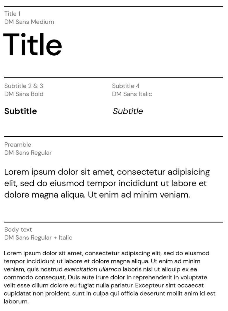
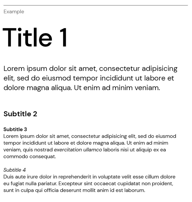
Main headings (heading level 1) use Medium, subheadings use Bold (heading level 2 & 3) and Italic (heading level 4). Preambles and body text use Regular. Italic is also used in body text to distinguish and highlight specific content. Heading levels 1 and 2 are set with setting optical kerning as well as pinching -15, making the text less sparse.
Please notice:
Just as important as the choice of font is how the text is formatted: size, line spacing, width of lines, bulleted lists, length of paragraphs, and text alignment.
- Centered text should be avoided
- Underlined text should be avoided
- Italic text should be avoided (for longer texts)
- Consider colour contrast to ensure readability. Only use the text colours recommended below.
Colours
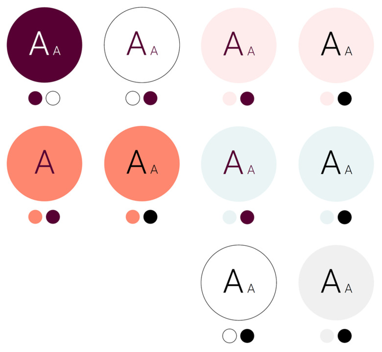
Typography is set only in the colours black, dark plum and white and against colour backgrounds where the contrast requirements are met.
The DM Sans typeface is available in all KI’s Office 365 templates and has been automatically installed on all computers within Coordinated IT. It is also available for manual installation through the Software Center.
Please contact Helpdesk (if you have Coordinated IT) or your department’s own IT support (if you are outside Coordinated IT) if you have problems accessing the typeface.