Blocks for content in Drupal
Blocks are the base of content publishing content in Drupal. Each block is designed to present a specific type of content.
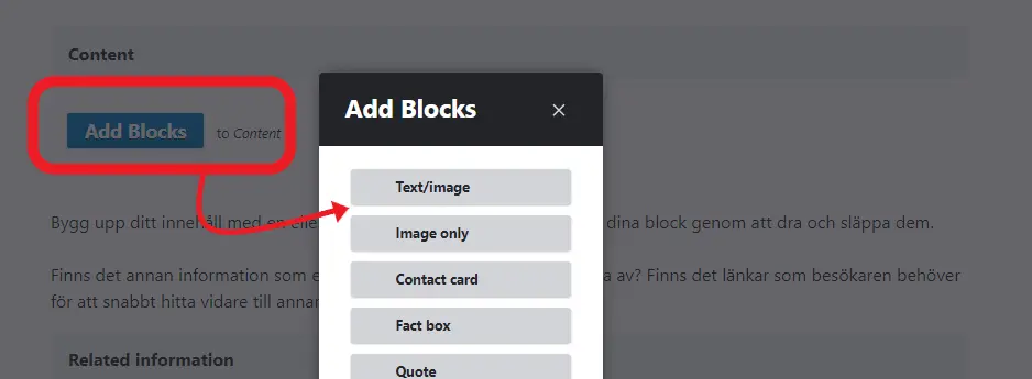
The "Add blocks" button lists all the blocks/templates you can use to build and structure the content on a page. A page can contain multiple blocks of the same type. For example, if you want to interrupt the body text to insert a video and then continue with the text, you need to divide the text into two sections. Place each section in separate Text/Image blocks and insert the video in an Embedded Video block in between.
You can rearrange your blocks by dragging and dropping them.
You can insert a block anywhere on the page. Here's how:
- Click the three dots at the top of an existing block where you want to insert a new block.
- Select Add above and insert a block.
If you want to add the block at the bottom of the page, you can also use the Add Block button.
These blocks are available:
- Text/image
- Image only
- Contact card
- Fact box
- Quote
- Table
- Embed
- Embedded video
- Links
- Documents
- Promos
- Call to action
- Agenda
- Accordion
- Chart
- Picture gallery
Text/image
Text with image. You can choose between three sizes for images. Read more in the manual about images.
Captions are added in a separate field.
Tools menu
In the text field there is a list of tools to edit text, Links to documents, pages, e-mail links and Pubmedarticles can be created also by adding a block. Which method you choose depends on how you want your page to look.
Under Styles, you find all headline formatting.
Text body (P) – Paragraph
Heading 2
Linked heading (h2) – Headline 2 that shows as a side bar menu (similar to anchor links). This will be collapsed in the phone view, so consider how you select these links. If the content is not too long, it's better to use the regular Heading (h2).
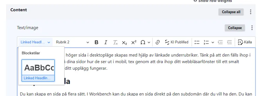
Heading (h3)
Erase formatting. When you paste text from a web page you might not get rid of all formatting. Select the text and click the formatting symbol to clean the text from code.
Subscript characters are used when you want to lower a number or a character in the word, e.g. H2O.
Superscript characters are used when you want to raise a number or a character in the word, e.g. 1st January.
Special characters - Click on the special character icon to insert these characters in your text.
Link symbol - Creating links both internally and externally as well as e-mail links. This feature can also be used to link to an uploaded document/file in the body text. There is also a block for links.
Bullet and number list - format for making lists
Pubmed - To insert a link to a publication in Pubmed, click on the DNA symbol and add the link, i.e https://www.ncbi.nlm.nih.gov/pubmed/31207604
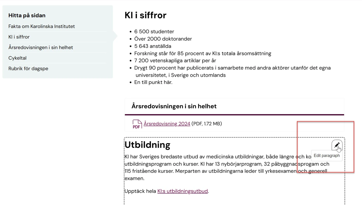
Edit a Single Block
When you want to edit a paragraph, hover over it and a pencil icon will appear. Select Edit paragraph, make your changes, and save.
When you do this, you're editing a block. A block can contain multiple text paragraphs, but it can also contain very little content depending on the structure of the page.
You will still be listed as the editor of the page, and the date will be updated. A new revision of the page will also be created, showing which paragraph you edited.
Contact card
Contact cards are created in the block Contact Card with the KI ID to the person.
Catalogue - standard contact card
All employees and affiliates at Karolinska Institutet have a profile page that retrieves all information from KI RIMS. The profile page is used to generate the standard contact cards, which are available to all editors across the website. The cards are dynamically updated when changes occur. The information that can be displayed in the contact card includes name, title, email address, phone number, and organizational affiliation. If the person has uploaded a photo to their profile page, it will also be displayed here.
This contact card is not created manually by you as an editor – it already exists in the system. When you want to insert a contact card for a person who has a profile page, this is the preferred option. Then, choose how much information should be displayed.
Insert a standard contact card
Select Add Block – Contact Card. Choose Catalogue and then search for the person by starting to type their name.
You can also enter an alternative title (role) to be displayed instead of the one retrieved from KI RIMS. This can be useful if a person is being shown in a different context than their primary one.
Custom card
Sometimes, as an editor, you may need to create custom contact cards. This can be useful when you need to create a contact card for a function, such as Registrar, or if the person in question does not have a KI ID. Fill in the fields that should be displayed in the contact card.
As an editor, you may also want to add additional text for a function or service, such as opening hours. In that case, enter this information in the text field, and it will appear below the other fields in the contact card. Select Custom Card and then fill in the fields you need.
Quote
In this block a quote can be magnified and italicized. It breaks up a page and emphasizes focus.
Fact box
A fact box can be added to highlight something important or just to list facts related to the topic. A fact box can have several different frame colors and extends across the entire width of the page.
Table
In Drupal you can create simple tables or upload tables as a CSVfile. Drupal does not support advanced tables. The tables can be created with or without headers.
You can change the number of rows and columns but they are added and subtracted from the bottom right. To create a headline, choose bold first row or bold first column.
You can also create links in tables. This is tricky and you need to know some html. so we recommend you to solve the problem in a different way for example by making a bullet list in the text or made a headline and textlist.
You cannot adjust the width of the table as the system works with one hundred percent responsiveness. This means that the site adjusts in size according to browsing device; mobile, tablet etc. If you have a simple table in Excel, you can upload it by first saving it in CSV format.
Text inserted in Caption will not be visible, only read aloud by speech synthesis.
Picture gallery
Use this block when you whant to show a slide show of photos and/or illustrations on your page. You need to add atleast three pictures to the gallery
- Choose the block Piccture Gallery
- Add a heading for the block (optional)
- Add as many images you want (one at the time) by choosing "Add picture gallery image
- Add a caption for the entire gallery.
Embed
You can embed content from any service like Google Maps, iFrames, Twitter and Instagram and our own Tool for lists (news, events, ads, etc). It is not ideal for video.
Embedded video
This block can be used for video services as it supports moving images better. You can also show video in a Promo regular.
Links
The links symbol is used to create internal and external links and email links. Du kan även länka till ett uppladdat dokument/fil i brödtexten med den här funktionen.
What is a good link?
The purpose of each link should be clear enough for the user to decide whether to follow it or not. Ideally it should be possible to understand where a link leads even out of context. Never write links of the type Read more or Click here.
An example of a good link is: "You can read more about the government's travel recommendations on the page The Ministry of Foreign Affairs' travel information on the website of the government."
Types of links
Links can be external, internal or email links. External links go to another webpage and look the same as in the address window, for example https://sll.se. Internal links go to a page within ki.se and should therefore use the site's location within Drupal. This way the link is always correct and you do not need to keep track of whether the url changes.
External links
- Select the words (preferably a full sentence or part of sentence) you want to link in the text.
- Click the link symbol in the menu.
- Fill in the external link under URL.
- Save
Internal links
If you link within ki.se, always use an internal link
- Select the words (preferably a full sentence or part of sentence) you want to link in the text.
- Click the link symbol in the menu.
- Insert the title of the content you want to link to. You should be able to put only a few letters and get suggestions.
- A list of options come up. They are shown in groups of pages, documents, news etc.
- Click the blue field once you found the correct content.
- If this is a page, the page ID or node ID is shown.
- Save
Email links
- Select the words (preferably a full sentence or part of sentence) you want to link in the text.
- Click the link symbol in the menu..
- Insert the email adress, like emailaddress@any.mail
- Save
Documents
PDF or Word-files can be uploaded in Drupal and linked with this tool. In connection with the upload you fill in what the document should be called. A good name makes it easier to find the document in the system when you need to link it to a page.
The easiest way to upload a document is through a page, but you can also go to the black list on top and select Content / Add media / Documents to upload documents.
Replace and remove documents
When you upload a document and, for example, want to replace it with a later version, you should replace the document container with a new file - the file is replaced but the link (URL) of the document is maintained. Do this:
- Go to My workbench.
- Select the tab Documents.
- Search for your document and click edit.
- Erase the file and upload a new one.
To delete outdated files, do as above but select the Delete option. The file is deleted and is no longer searchable. As an editor, you cannot delete files or document containers that you have not uploaded yourself.
Make it easier for the user to find the document
When uploading a document, it is important to fill in the Notes field. This acts as a lead and will appear in the hit result when someone searches for your document. Use up to 250 characters to describe what your document is, and how the content can be used. If you fill in this field the chance of your document being found is increased. If you do not fill it in, only the document title will be displayed in the hit result, so a user might find it hard to tell whether it is the right document or not as suggested in the hit list.
Promos on a page
On pages, promos can be inserted into rows of one to three. If you want to add more promos then you need to create a new promo block.
You can choose to have a summary title for the row of promos if it can help a user understand what your promos have in common.
Select how you want your promos to appear on the page by selecting the symbol that corresponds to the layout you want. You can choose to have a gray or plum background on the entire row.
Accordion
The block accordion hides a part of the page only showing the headline until the visitor actively chooses to show it. An accordion can create a good overview of your page but you need to have very clear headlines since that is all a visitor can see until they open the accordion.
- Select the Accordion block
- Add a headline in the field Headline (optional)
- Add a clear headline
- Add text. The text cannot be longer than 1500 characters. If your text is longer, you need to split it into smaller parts or consider a different format.
- Add an item to your accordion - Add accordion item
- Repeat step 3-6 until you have added all the content you want to your accordion.
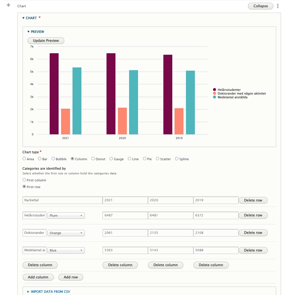
If you want to display a chart, use the Chart block. Here, you can choose from several types of charts – such as pie charts, line charts, columns, bubbles, and more.
Enter your data into the columns and rows, then use Preview to see which type of chart best suits the information you want to present. You can choose from a range of colors, and further down you can also customize how the information is displayed on the webpage.
When you're done, simply save the page as usual. For visitors, the chart is accessibility-adapted, and it is also interactive – allowing users to highlight parts of the chart.